@Wesley Chiang 'I like that this bowl looks alive, especially with the fruits in it... They really look like they are making the bowl 'splash'
I'd grade the colouring on the bottle caps to increase the dynamics and add that little bit extra. It could also perhaps be a touch bigger.'
@Helen Holman
Congrats on this project. I really like it, as I mentioned to you in class. The craft(wo)menship is amazing.
I'd add a few things such as the apporiate hardwear to adjust the strap length and a coloured lining so you can identify objects easily inside the bag.
@Steph Hutcherson
Awww steph I really like this! The overall form is nice, and it does seem to work. Use of the phonebook as a material is very clever.
I would probably change the nut and bolt to something more elegant and thats about it.... the only thing is a wet knife *may* spoil the paper? Would there be any tranfer of ink to the knifes surface from heat/humidty?
@Melinda Kingsland
Yeah Mel! Great looking product, functional and very creative in the concept of the idea.
Seeing a 'nerd' may buy this, the addition of acouple of extra pockets might appeal to that consumer abit more?
The abilty to have different cases with the same concept as this, but different sizes - creating a range leads to me thinking it could be a commercial prospect.
@Henry Treloar
I would of liked this project because of what you made out of it, but even if I looked at it critically, I like all the features of it. I can see it on my desk, with a computer next to it. Even non-cyclist would like this I think. The colour choice, shape, form and concept are all great. I can see this item at shops like myer and davidjones. Wouldn't change anything and i'd take one while I was at it.

Showing posts with label IDES1031. Show all posts
Showing posts with label IDES1031. Show all posts
Tuesday, October 26, 2010
Upcycling
Here is my last project. 100% not happy with prety much all aspects of it due to the last week and its events that most of you know about. Anyway:

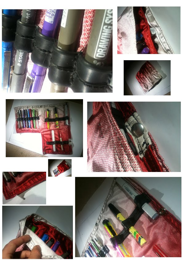
The Sketch Artist Pencil Case
Rationale:
Using cut outs from a polyester banner as the base material the Pencil case can be very interesting and unique. The Banners vary greatly and a constant supply is guaranteed through Sydney council and other marketing companies who produce these flags. Each banner contains around 8 metres squared of material and each base bit of material only use 0.12 metres squared. Allowing up to 40% waste you can still get 30-35 pencil cases out of one banner.
The Inner Tubes used in the Pencil Case are from a bicycle. A single tube is used per Pencil case. Used Inner Tubes can be sourced from bicycles stores easily and there will always be a constant supply.
Both Materials can be obtained for free or very little cost. Allowing for transport you may say costing in material for each Pencil Case is less than a dollar.
In the Construction of the Pencil Case, Press studs and cotton line is used. This will cost less than a dollar per Pencil case as both are cheap. There are no adverse affects to the environment using either material in these quantities.
Construction of these Pencil Cases could be streamlined and worked in an assembly line which means you could produce around 15-20 Pencil cases an hour or more depending on the skill of the person. If each pencil case sold for $39.95 (or more) than you could make a small business off the back of the Pencil Case’s depending on sales. As there is no shortage in materials you could continue to make these, offering each a different style from different banners as a limited edition. (i.e the banner used in the construction of the presented project was part of the Sydney Film Festival Banner so it would be part of the Sydney Film Festival Collection.)
This Product could be found for sale in Art shops and tourist shop (Sydney banner) with a wide range of potential consumers not limited to those who are just artistically talented. It could also be offered full with pens, pencils and markers at an adjusted price point.
The design features of this product are in the details. Dual tone stitching (Black and Gray) adds increased contrast the Pencil case while framing the unique Base of the Pencil Case. The Heavy duty Inner tubes are sewn and spaced so that multiple types of stationary and equipment will work and fit increasing the dynamics this product offers. The double sewn edges and reinforced areas are the push/press studs to increase durability. The layout of the Pencil Case allows the user to open either section individually but also identify and select stationary without opening the Pencil Case at all. The Marker section is open and wide which provides a target zone to leave markers when switching between them so that you don’t those them and always know where they are. The simple nature of this product and usability along with the uniqueness and limited edition nature of the product will ensure the success of the product.
And the transformer poster.

Task 6d
Gary Hustwit: Objectified
As a designer I found this video REALLY interesting, the insight into other designers minds, thoughts and philosophies really help whittle down what I, as a designer want to aspire to, and what I want to motivate me, like form, following function and the whole dieter rams: ‘less, but better’ motto.
I think Mac have really latched onto ‘less, but better’ and have really made it there own considering there lap tops and other technologic mediums. There Mac Book Air as a product, is *insert explicit word here* beautiful, even if you don’t like apple products (whether that be reasonable or not), it’s a great looking thing, even if there’s a lot less of it then other net book style products out there.
Having something that nice, that you can connect to (emotional design – bloody love it) can have a few things contribute to it. Products – like Macs to some – are a pleasure to use, and you can become attached to them because of it (or cause you spend waaaaay too much time on them each day). The other reason is products which over time don’t wear out, but in – like a nice suit case, probably leather. Leather is one of those things which does get better with age and on a personal note, I know this. Take the popular brooks b17 leather touring saddle (bicycles) – known for just this – getting better with age, the more you ride on it, as it moulds and softens to your butt. Yeah this kind of stuff motivates me, my purple d-clip which holds my keys has that much anodise worn off its now more silver than purple, but it’s still my ‘purple’ d-clip.
Oh and if I can ever design products like invisible lights in laptops, or something that could rival dieter rams – I’d be a happy many. Happy days – now to go for a ride on my brooks saddle! Happy holidays y’all, see you next year.
Task 6c - Annie Leonard: The story of stuff
http://www.youtube.com/watch?v=9GorqroigqM&feature=player_embedded
Interesting Video about the importance of comsumers in society and the way trends have been castalysted by them. The current throw away trend of new, cheap throw away items certainly grabs my attention because as a cosumer myself, I like to buy something that will last, that I will love and that has had thought put into the design of it. I also don't want it spotaneusly combusting on me when a newer version of it comes out. (the curse of built in obselence)
As an Industrial designer/studnet, the need to change this trend as well as the consumers actions through good products, which they'll want to keep using, and grow an emotional connection to (much like the previous discussed video by Don Norman). Obviously without a need to purchase new products, the amount of new products produces decreases, therefore less waste = good for the environment. (personal note: we NEED to look after the environment.)
I think this video also raises a valid point about the amount of materials being used. If society keeps on using (whether by choice/trends/other)disposiable products, the materials to make the products will eventually run out, and the current consumer climate, although not promoting this, does however, allow these, materials to be used, and the enovironment won't be able to substain this forever. (unless we adapt via new systems and technologies which may allow this).
By designing stuff which will last, of that we can atleast control the story of (somewhat), by doing this, as designers, we can control the amount of poetential waste, waste which is caused by Consumerism, which is bad, if you haven't noted.
These are the points I dwelled on most as they seem to be the most relevant at the current time.
Tuesday, September 28, 2010
Peer comments.
@Mikee's -
'I rather like this idea. The bold, solid shape, is slightly mysterious and doesn't hint at what it really is. As soon as the pencils go in, you can tell that it is an echidna – your target markets probably all over that. Colour is good, and with a slight tone change, it wouldn’t be out of place in the dinosaur designs coral sea collection.
The only thing I think I would change would be the overall shape. Something more like a cartoon, with a basic form of an echidna – almost like a character. '
@Xavier Mancini -
'These don’t belong in a draw, these are art. I really like the form of these, individually and as a pairing. The contrast in the two textures, brushed and shiny really adds just a little more class!
Personally, I think some colour (on the edges) might add to the appeal of the servers which may appeal to a larger market.'
@Daihyun Jang
'I love the idea of a strainer you can hold, while pouring out water. The thermachromatic paint which increase the dynamics of this product appeal is very clever.
In terms of improvements further development of the shape might prove to be successful?'
@Eunbi Yoo
'The look of this product is something to behold, its so interesting. The contrast between the gloss white and pine grain is awesome. Add to this the stainless silver whisk end and the colour palette choices is that of a genius. As a whisk I personally cannot see it working, but who cares when a child trying to cook - lets face it - the majority can't and just make a mess.'
@Seb Gregable
'First off, GREAT presentation.
The idea of the project is great, as was the exception. The socio aspect of the project is really interesting. Although I don't drink coffee, I'd happily have this sitting on my coffee table.
I would like to say that the colour scheme may benefit from a lighter tone, or something more vibrant - but I can't, because I'm not someone who buy this product and use it as intended. A job well done I say.'
Monday, September 20, 2010
Project 1 COMPLETE

Spanner Lock
The Spanner Lock is aimed at Males, 18-27 in age, who are the Inner city dweller type. These people are into ‘fixed gear bicycles/fixies’, attends social based rides and alleycat’s. This person is somewhat of a utilitarian, and is efficient and organised.
His preferred method of transport is a bicycle.
The lack of freewheel on a fixed gear bike means 100% efficiency and often these bicycles don’t have brakes – adding to the minimalistic aesthetic. While riding this type of bicycle it requires full concentration – distractions such as loose backpacks, rattling frame mounted bags or a spanner falling out of your pocket is the last thing you need. That said, a basis for the project and criteria was created. The project went on.
The result: A foldable tool with 15mm spanner combined with a lock.
A bicycle chain has been used as a handle as is allows movement down one axis but the other, is solid and does not ‘fold’ which allows enough leverage so to be used as a handle of a spanner. This also allows the handle to fold and the product to fit in the pocket of the user. This is important to the user group because it allows him to fold the product up and fit it in his pocket (front or back) thus eliminating the back pack.
An aluminium alloy would be used as a main material for the body/solid section and hardened steel alloy for the spanner/socket end and the lock. The body will be lighter and easier to machine with the aluminium alloy body and the ends will be tough and longer lasting with the hardened steel alloy. To the user this is important as it is long lasting, but light enough to have in his pocket.
The shape of the barrel is cylindrical for two prominent reasons. Firstly it’s easy to machine/manufacture while secondly there are no sharp edges or points, which could cause more damage in the event of a crash.
In terms of size, the barrel is around the size of a bicycle tube in diametre and the length is short enough to comfortable fit in jean pockets. The user group would almost always ride in rolled up jeans or cut-offs (jeans with the legs cut off into shorts).
The solid black colour gives a sense of strength while also actively does not draw attention to it. Black also doesn’t ‘clash’ with any colour. This is important because the bicycles they ride are more often then not are beautiful.
The chain handle is offset to allow for the lock mechanisms and a colour band closer to the lock end for easier identification, thus making it easier/quicker to unlock the lock. 15mm socket as this will fit the nuts on the axles of both the front and back wheel of a fixed gear bicycles the user would ride.
The inner tube is used over the chain to prevent scratching to the bicycle while locked up and also adds to the aesthetic and items appeal. The user likes bicycle related stuff. This product has so much of it the user takes every opportunity to show it of to his friends. Grippy/Rubber handle provides comfort for user. The lock is inset so that thief’s cannot lever it out, providing greater safety.
A situation this lock would be used in would be if the target user group needed to go up to the shops for whichever reason. He’s not going to bring a backpack because he doesn’t need it, because he has the Spanner Lock in his pocket. He gets to the shops quickly and locks the bike up to a pole without a fuss. When he’s inside he bumps into a friend, and stays for a chat, knowing his bike is safe….and that he doesn’t have a sweat dripping down his back from backpack. He walks outside, bike still where he left it. Due to ‘Murphy’s law’ because he has all the tools he need with him (in pockets) nothing goes wrong with the bicycle. Not even a flat to dampen his mood.
Talking to this friend proves to be the catalyst for a very good day.
Context of use:

Four Pleasures:

Photos:


Monday, August 30, 2010

Tuesday, August 17, 2010
Task 6b
Introducing, Don Norman: New, beautiful and a self proclaimed positive being.
Norman’s discusses his view on ‘emotional design’ – how a product can create emotion with the end user, and how that effect’s the view on that product and the ‘why’.
Fun design – Products which may not ‘work’ but play with your mind enough that you want it! Just like Alessi’s Juicer. Interesting, fun and a conversation piece – but not very effective at juicing. I reckon that’s a pretty cool thing to be able to achieve – to create a product that doesn’t work very well but everyone still wants it – and coming from me who is equally driven by function vs aesthetics’ is quiet a big thing. Same goes with the mini cooper – not the best – but the funnest – therefore the best. This concept of fun design is something I’d like to follow and brands such as Volkswagen with their fun theory already have!
Saying all this, the ping pong table with water and fish is just plain and simple awesome and really proves that ‘pleasant things work better’ That itself is such a bold, but alas – seemingly true statement. Making the end user WANT to use a product through the joy alone – that’s something worth designing for.
Fun products not to be outdone by beautiful design – The global knife, brings all elements of design together to create a ‘perfect product’. As a designer I hope to be able to create at least one of these. It’s the little touches which make this the ‘ultimate’ knife. Simple and subtle designs; such as the google ooooo’s is also a great idea. Simple and subtle things definitely make a great product better, in my opinion.
The psychology behind this I find personally interesting. Already aware of some of the work Alice Isen has done, I enjoyed Norman talking about the said experiment. Learning something new is always fun!
Continuing on the theme of psychology and the spiel about how our brains works under pressure (to a deadline) vs having fun and its affects of creativity was personally interesting and has explained the way I tend to work,
Summing up, this video has broadened my thinking a little, in a good way for sure. Whether it be the clever teapot which just urges to be used or the water bottle which you’re using for a vase, you know, because it looks pretty cool and you don’t want to chuck out – the invitation of emotion into design, and its effects on products because of basic human thinking (the way we are hardwired) is something of worth.
As for the chair, losing its ball – priceless.
Tuesday, August 3, 2010
Task 6a
Human Centred Designed.
To say this video resonates with me would be fairly correct. From the very start til the very end.
http://www.youtube.com/watch?v=eXndL3TNCmo&feature=player_embedded
'Once a year...
...1000 remarkable people gather in Monterrey, California
to exchange something of incalculable value
Their Ideas'
Just Yes. It’s just so right, what I couldn't put into words before can now be eloquently, 'Ideas are of incalculable value'. I've been excited before someone has even opened their mouth.
When David Kelley opens his mouth it a lot of good stuff which comes out, and his experience in the industry really shows. Presenting ideas in the form of video (as an experience) has defiantly broadened my thinking, especially in presentation.
In the video a product such as the Lesino/lezinyo? Reader screamed iPad to me, but then realising that the iPad is 8 years younger. Also proving the point apple really know know to take technology to the masses. The whole interactive design in the museum is something I like a heap, getting pretty involved, by making things fun or something someone wants to do is a cool concept which Volkswagen have embraced with the 'fun theory'.
The cubical design reminds me foremost of ideo, in newyork, and their workspace. By creating a better work environment, workers are happier, they work more productively, and life is 'sweet'. And just like that ad on tv which I cannot remember the name of, happiness is contagious.
Spyfish, kind of lame and seems to be a product that was created to solve a problem that didn't exist. I'm sure it works, and does everything like it said, but surely it would be a small market. Cool use of technology but really, leave that spyfish for researchers and get yourself some goggles. Unlike the aprrotech project which is jaw-droopingly-cool. The world would be a better place if there was more like it.
Some of the ideology in this short video such as the human centred designed concept is pretty rad. The idea of designing an object to steer a behaviours and/or emotion of the end user is something which I picked up from the ideologies of bus designs' Steven Bauer. 'Aesthetics is more than just a way an object looks, it's the way an object makes the user feel'. The idea of being able to implant a certain reaction within an object is very appealing, and to be able to provoke an emotion itself through design, well, awesome.
All in all, the video was really good (minus the BMW's) in widening my thinking in a number of fields, but I would really like to here some of David Kelley's moustache's thoughts on a few of the matters next time.
To say this video resonates with me would be fairly correct. From the very start til the very end.
'Once a year...
...1000 remarkable people gather in Monterrey, California
to exchange something of incalculable value
Their Ideas'
Just Yes. It’s just so right, what I couldn't put into words before can now be eloquently, 'Ideas are of incalculable value'. I've been excited before someone has even opened their mouth.
When David Kelley opens his mouth it a lot of good stuff which comes out, and his experience in the industry really shows. Presenting ideas in the form of video (as an experience) has defiantly broadened my thinking, especially in presentation.
In the video a product such as the Lesino/lezinyo? Reader screamed iPad to me, but then realising that the iPad is 8 years younger. Also proving the point apple really know know to take technology to the masses. The whole interactive design in the museum is something I like a heap, getting pretty involved, by making things fun or something someone wants to do is a cool concept which Volkswagen have embraced with the 'fun theory'.
The cubical design reminds me foremost of ideo, in newyork, and their workspace. By creating a better work environment, workers are happier, they work more productively, and life is 'sweet'. And just like that ad on tv which I cannot remember the name of, happiness is contagious.
Spyfish, kind of lame and seems to be a product that was created to solve a problem that didn't exist. I'm sure it works, and does everything like it said, but surely it would be a small market. Cool use of technology but really, leave that spyfish for researchers and get yourself some goggles. Unlike the aprrotech project which is jaw-droopingly-cool. The world would be a better place if there was more like it.
Some of the ideology in this short video such as the human centred designed concept is pretty rad. The idea of designing an object to steer a behaviours and/or emotion of the end user is something which I picked up from the ideologies of bus designs' Steven Bauer. 'Aesthetics is more than just a way an object looks, it's the way an object makes the user feel'. The idea of being able to implant a certain reaction within an object is very appealing, and to be able to provoke an emotion itself through design, well, awesome.
All in all, the video was really good (minus the BMW's) in widening my thinking in a number of fields, but I would really like to here some of David Kelley's moustache's thoughts on a few of the matters next time.
Task 2
No idea how to start this. I talk a lot, but seem to struggle typing. I blame the fingers.
Since I've been able to tie my shoelaces up I’ve always pulled stuff apart, from pens to toys as a kid, to now bicycles, and cars. I've always had an interest in how stuff works, why it works and why it didn't do 'that', just like 'this'. Since senior school I've always preferred the workshop to the class room. That hands on stuff was the best, always beats scribbling in books.
I've worked in retail for almost 4 years in 3 different jobs, I enjoy this. To say I'm into cycling would be an understatement. I have an opinion of everything. I like to be well informed and know lots, and spend a large time on the internet cause I followed a link that led to something interesting, which led to something else interesting which lead to another thing which I didn't know but a few more links helped my understand that other thing. I’m very passionate about a few things. I’ve usually got about a thousand ideas. I often wonder why I can’t get my thoughts into words, or drawings. I go off on tangents regularly.
Year 11 came around and I picked as many 'hands on' activities as I can (industrial technology and Design and Technology), which both contained major projects in year 12. The following year my design and technology teacher REALLY influenced the way I thought about design, and the way I went about 'it'. IDEO is also a big influence on my design thinking. Armed with this I took on industrial design at uni, content with this choice thus far.
To be honest, I still can't pin point exactly what influenced me to make this decision but I have a strong imagination and can picture myself sitting at a large desk, cluttered with sprawl, thinking about how to solve that issue, unknown at this time. I don't know what it is but I just know and want to do this, this industrial design.
I want to be able to design everything
I want to design everything really, from systems to products to the logos and mottos of a company
I want to design anything related to cycling
I want to make my own business, big or small
I want to work/live in New York, Germany, Canada, England, France and New Zealand but end up back in Sydney
I want to have job that I love and look forward to each day
To sum the clutter up, I want to innovate products and create those ‘why didn’t anyone else think of that’ solutions to problems faced everyday. Designing solutions, that’s sounds good lets leave it at that.
Task 1
Shape a scent, weird, but we'll live. Now the concept wasn't to come up with a bottle, but the physical shape, of the scent. The medium used was clay. The battle lines were drawn, and the stage set. All hell broke loose, as I rumbled with the medium, using ever ounce of creativity against the stubborn clay for what seemed like hours.
The result.

The result.

'The three sided polygon symbolises the versatile scent, showing the volume and strength, while the smooth surface represents the smoothness the scent possessed. The concaved sides create a vector to top centre where the 'pod' opens into rough textured surface representing the Moroccan and herby undertones, which seemed to flourish from the more polished midtones, in an almost flower like manner.' - anonymous
Subscribe to:
Comments (Atom)